
A Journey to a new workflow: Introducing W3b{Blocks}
It’s been a while now but finally I had some time to set-up some started projects.
A
while back I was doing a lot of research into all the new methodologies
and technology’s. After reading and testing a lot with Local storage,
Responsive Web Design, Mobile First, Progressive Enhancement and
Graceful Degradation.
Progressive Enhancement approach
I
realized that having those new skills is great but how to use them?
This made me think about my work flow and how to approach a new project.
It has to be Mobile First, but Graceful Degraded or Progressive
Enhanced? And what with Responsive Design how to tackle this? A while
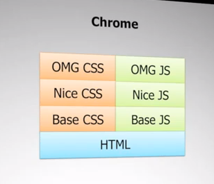
back I saw a presentation
from Nicolas Zakas and when seeing this screenshot on the right I
realized that we have to try to create our UI as simple as possible and
then layering up.
This results in a long journey of reading, watching video and hack some stuff together to test and get results.
Where to begin?
That was my first question, I based my quest on the slide of Nicolas. After reading this article about “The best interface, is No interface” I was convinced about my decision that “Content is king” So whatever you create on the web or for machines it should be readable for everybody. The second thing is that it must have a decent structure on every screen, mobile, tablet, notebook, TV, Video-Billboard, Digital magazine adverts(Amazing) but even thin-clients with basic hardware.
So I started to develop my own interpretation of working in layers based on Nicolas’s slide and created my own version.
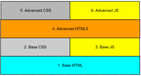
Based on the slide from Nicolas I created my own version.
- First layer is Base HTML = just HTML to create structure
- Second layer is Base CSS = fluid, color, font, widths, padding, position …
- Third layer is Base JS = toggle classes, getElement, UI stuff …
- Fourth layer is Advanced HTML = HTML5 semantic tags to create structure
- Fifth layer is Advanced CSS = responsive, pseudo-elements, pseudo-classes …
- Sixth layer is Advanced JavaScript = Canvas localStorage, Cache Manifest, WebGL …
As you can see I added a second HTML layer, the reason for this is that there are still a lot of browsers that don’t understand the new HTML5 elements and rules.
By following these rules I found the path I have to follow to get it right.
- Structure
- Style
- Functionality
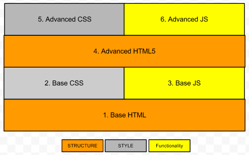
Structure
I know all CSS is considered style, but to determine what Structure is I divided CSS into two groups.
- CSS Structure
- are all the thing we use to place certain elements on certain places.
- float, position, display, top, left, flexbox, units(em & %)..
- CSS Style
- all the other things to provide a nicer presentation:
- color, box-model, fonts, align, pseudo-class and element, gradient
To have a good structure everywhere you need to control four layers.
- First layer is Base HTML =
- This means a basic structure and outline laid down with basic HTML elements. Keeping “Mobile First” in your head, designing only with these elements force you to come up with a structure with limited elements viewable by everybody.
- Second layer is Base CSS =
- The CSS will only use a structure set to add some nicer positioning. Also it will be in charge of the fluidness by using em’s and %.
- Third layer is Base JS = toggle classes, getElement, UI stuff …
- Fourth layer is Advanced HTML
- Using HTML5 semantic elements
- Fifth layer is Advanced CSS
- Add Media Queries to make it responsive and adapt to a suitable time & place experience
- Sixth layer is Advanced JavaScript = Canvas localStorage, Cache Manifest, WebGL …
My journey started with finding all kinds of CSS frameworks and methods and looking closer to the new spec and the pseudo-elements and classes. Things like Blueprint, Less, Sass, the Golden Grid, Less Framework 4, GridLess, 960-Grid and so on.
I tried them but was not satisfied by the way they worked. Of course I learned a lot reading all that code. Most of them assumed that you design with grids in a design program. Unfortunately I didn’t learn to design based on grids and gutters, and I don’t like to design in a design application but prefer to do it in code after a sketch.
I started to search to the most common website layouts and found this article about “10 rock solid website layouts”. When looking to all those layouts I began to think about how I start with a new layout.
Thinking in Blocks
First I have to tell you how I think about programming and web design. Having spent my childhood with Lego I like to think in blocks. For example a header is a block, a logo inside that head is a block, a search function or sidebar I see everything in blocks.
After defining which functionality I need for a project I start drawing blocks on a page and give them names. If I look at a few of my sketches I see that most of the layouts also contains lines. Looking at a lot of different websites online I discovered that you can create all layouts with lines and filling these lines with blocks. Instead of using columns and gutters I use lines & blocks. The same period I found a HTML5 based Tetris game and I discovered the same pattern create lines with blocks and w3b{Blocks} was born.
W3b{Blocks}
W3bblocks is my view on Responsive/Fluid web design. It’s based on a terrific game that everybody knows, Tetris or Blocks pick one. You create Lines and fill those Lines with Blocks, that simple. It reacts to different device sizes and is just logic. Look at an example page.
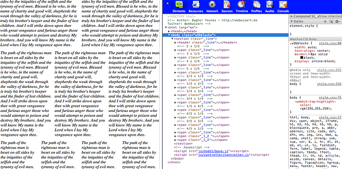
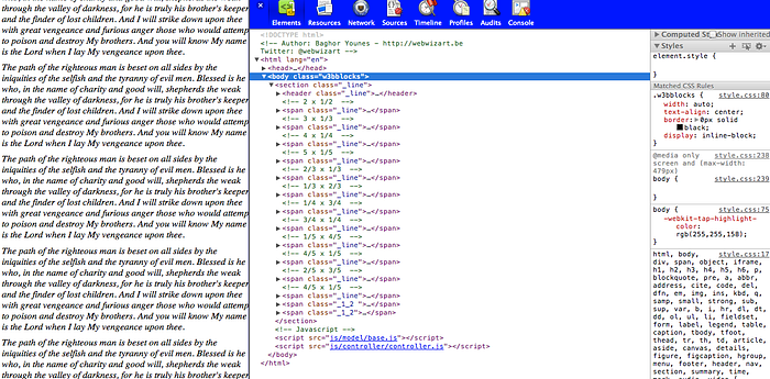
W3b{Blocks} is based on padding to create gutters. You create lines and fill those lines, for example if you want to have a header containing a logo on the left and a navigation on the right. Create a span, div, section and add the _line class. Nest two new elements with the ._1_2 class and you have a header containing two even wide elements.

<! — 2 x 1/2 →
<span class=”_line”>
<span class=”_1_2">
</span>
<span class=”_1_2">
</span>
</span>
<! — 3 x 1/3 →
<span class=”_line”>
<span class=”_1_3">
</span>
<span class=”_1_3">
</span>
<span class=”_1_3">
</span>
</span>
<! — 4 x 1/4 →
<span class=”_line”>
<span class=”_1_4">
</span>
<span class=”_1_4">
</span>
<span class=”_1_4">
</span>
<span class=”_1_4">
</span>
</span>
….
Or you you can use uneven blocks like so
<! — 1/3 + 2/3 →
<span class=”_line”>
<span class=”_1_3">
</span>
<span class=”_2_3">
</span>
</span>
<! — 1/5 + 4/5 →
<span class=”_line”>
<span class=”_1_3">
</span>
<span class=”_2_3">
</span>
</span>
<! — 2/5 + 3/5 →
<span class=”_line”>
<span class=”_1_3">
</span>
<span class=”_2_3">
</span>
</span>
And it’s Responsive ;-)
Wide
Tablet
Phones
There is still a lot of work but it already improves my work flow, the first thing I got to work on is nesting. If you nest elements scaling of images and widths of padding change, this gives a bad result but hey it’s an alfa edition. To solve this temporally I us padding add & remove classes.
You can find more info on my web space at w3bwizart.be/w3bblocks or check it on github
Next time you can read about my Functionality Journey ;-)
-- Als je vragen hebt, aarzel dan niet om Contact met ons op te nemen. We helpen je graag verder. We kijken er naar uit om je te helpen bij de groei van je bedrijf. © 2023 WebWizArt.be BV. 🇧🇪 🏳️ 🌈 🏴 ☠️ All rights reserved.
Comments
Post a Comment